Chapter 11: The Assets
Why trying too hard to be meaningful backfires, and how meaning-free brand assets make you impossible to forget.
OK—we have a monster to rally people around, a POV to send trusted signals to the people in our segment, and spices to back them up with real behavior. Now let’s talk about branding.
Rewind to the days of my tragically flawed marketing agency. I was thinking about building a software solution called “Slices,” a tool for e-commerce businesses to use to dissect data and personalize customer communication.
I thought the name was clever since it referred to slicing and dicing data. When I pivoted to offering services, “Slices” and its scalpel logo made perfect sense to me.
Figure 11.1. Slices logo.
But it also tasted about as exciting as a glass of tap water. Psychophysicist Mark Changizi explains that water tastes like “nothing” because our brains are hardwired to perceive it that way—and not because it lacks flavor. Basically, any hint of a different taste could signal danger, so our brains default to neutral to keep us safe. Back in the day, this was a matter of survival.
The same principle applies to your branding. If it looks, feels, and tastes like everything else—like lukewarm water—it’s invisible. People’s brains won’t even register it.
The Problem: We Try Too Hard to Be Meaningful
And that’s what happens when branding tries too hard to be meaningful. Like my old agency and its scalpel. Or copywriters using fountain pens as their logo. Or those nonfiction books using “f*ck” in their title (oops).
Research about how our brains work shows that we don’t buy things based on the meaning of a brand. You don’t hire FedEx to deliver a package because its logo has a hidden arrow. You don’t buy chocolate bars from Toblerone because the yellow mountain is actually a bear. And you didn’t choose to read this book because there’s a rooster on the cover (his name is Roger, by the way).
Worse than that, choosing a branding asset based on a preexisting meaning could harm you because it may:
-
Clog your customer’s brain. Instead of your brand popping into your customer’s head, you might also compete with other memories associated with an asset that have nothing to do with your category. Which might make it harder for customers to remember and choose you.
-
Make you a copycat. If you’re chasing the same meanings as an alternative, you risk arriving at the same exact point and looking like a cheap imitation.
-
Go stale. Today’s hot topic is tomorrow’s old news. Building your brand on a trend is like building a house on sand—it’s unlikely to last.
-
In other words: meaning, in and of itself, doesn’t mean shit.
The Solution: Be Meaning-Free
You see, we pick a certain category or brand because something within us or our environment—where we are, who we’re with, what we see—triggers something. Not because of some deeper meaning.
Assets are the distinctive bits and bobs that make your brand uniquely yours—could be a color, shape, sound, word, or even a mascot. The goal? Create meaning-free brand assets that tickle different parts of the brain. Why? Because it helps build stronger memory structures without competing with all the other crap floating around in people’s heads.
A bit more neuroscience to back this up:
-
Faces. We’re hardwired to notice them thanks to the fusiform gyrus in our brains.
-
Colors. Colors are processed in the occipital lobe, with different neurons responding to various light wavelengths.
-
Phrases. Phrases are handled by Broca’s area (for speaking) and Wernicke’s area (for understanding).
Figure 11. 2 is my attempt to show you where those areas are in the brain.
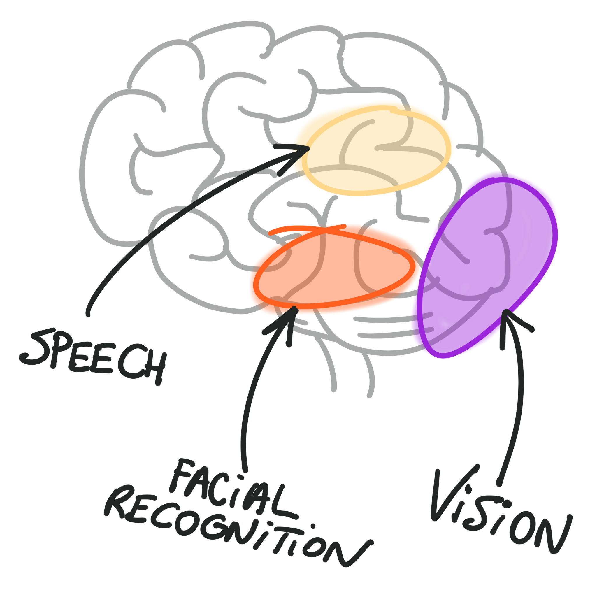 Approximate areas of the brain dedicated to recognizing faces, colors, and phrases.
In other words, your branding assets should work together to have the highest chance of being noticed and building stronger memory structures.
Before going further, let me clear up something. I’m not saying go completely bonkers with random branding. A trash can logo for a tech-focused accounting firm? Probably not. But find that sweet spot—recognizable yet distinctive. Challenge some category conventions, but not all. You don’t want to confuse people to the point where they’re scratching their heads, wondering what the hell you are.
Take the Danbury Trashers. Their logo? A mean-looking, animated steel trash can .
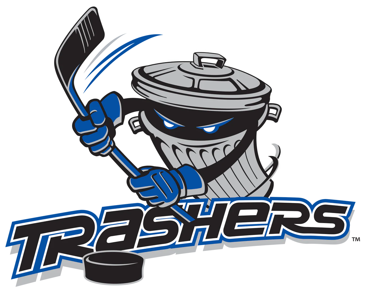 The Danbury Trashers logo.52
What are the chances that any other hockey teams, let alone sports teams, use the same? Zero to none. But the Trashers kept the hockey stick, grounding it in their category. It’s unexpected and distinctive, without leaving people clueless about the sport they play.
Of course, nothing is entirely meaning-free, but explore branding elements that don’t scream what you do. It’s about being distinctive, not obvious. With that in mind, Jenni Romaniuk in How Brands Grow (Part 2) advises to design a diverse palette of distinctive assets with the following elements:
-
A color (or a color combination)
-
A logo or shape
-
Something with a face (a character or spokesperson)
-
A sound
-
A short phrase
-
Combining each of those elements creates a solid starting point for being distinctive—yet highly recognizable.
-
Example:
-
I realized last year that my own brand needed a refresh. I wasn’t practicing the very principles I preached.
-
So, I challenged myself to go to the edge of the map and find the most distinctive brand assets possible in a super-crowded category. I wanted to be very deliberate and intentional by doubling down on elements I knew were working while developing others that had huge potential. I ended up developing the branding kit in Table 11.1.
Table 11.1. My Distinctive Branding
| Asset Type | Stand The F*ck Out |
|---|---|
| A color (or combination) | Black, orange, purple. A bit flashy for the category, but not unique. |
| A logo or shape | Sticker-style graphics, mimicking the appearance of physical stickers |
| Something with a face | Roger the Rooster, my French rooster with questionable fashion sense. Not totally meaning-free (French rooster = nationality), but very unlikely anyone else in my category will use it. |
| A sound | My French accent. I used to hate it. Then I realized others noticed it. So I doubled down. |
| A short phrase | Stand The F*ck Out. Duh. |
It’s not totally meaning-free since a French rooster connects with my nationality. But it’s not directly related to what I do for work, which makes it very unlikely that anyone else in my category will use it.
A sound
My French accent.
I used to hate it; I even tried to suppress it. But then I realized it was something that others noticed. So I doubled down on it.
A short phrase
Stand The F*ck Out.
Duh.
Say bonjour to Roger—Figure 11.4.
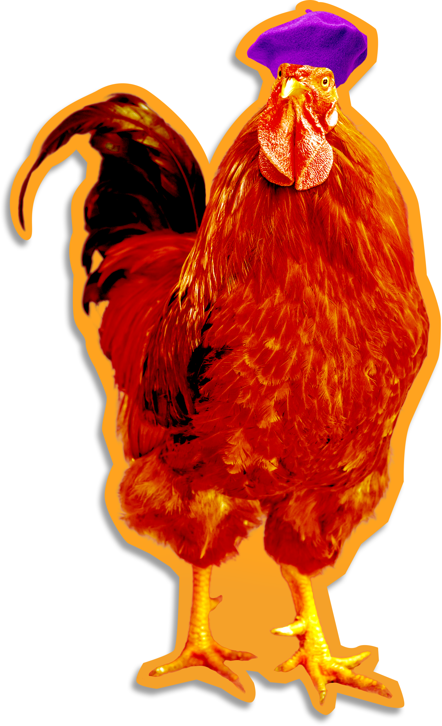 Roger the Rooster and his distinctive purple béret
Example:
Picture this: launching a business with just $250, in the wake of Hurricane Katrina, in an industry you’re clueless about. Now imagine turning that gamble into a multimillion-dollar brand. This is the story of Demo Diva, where Simone Bruni (pictured in Figure 11.5) didn’t just enter the demolition industry—she smashed through it like a wrecking ball (cue Miley Cyrus).
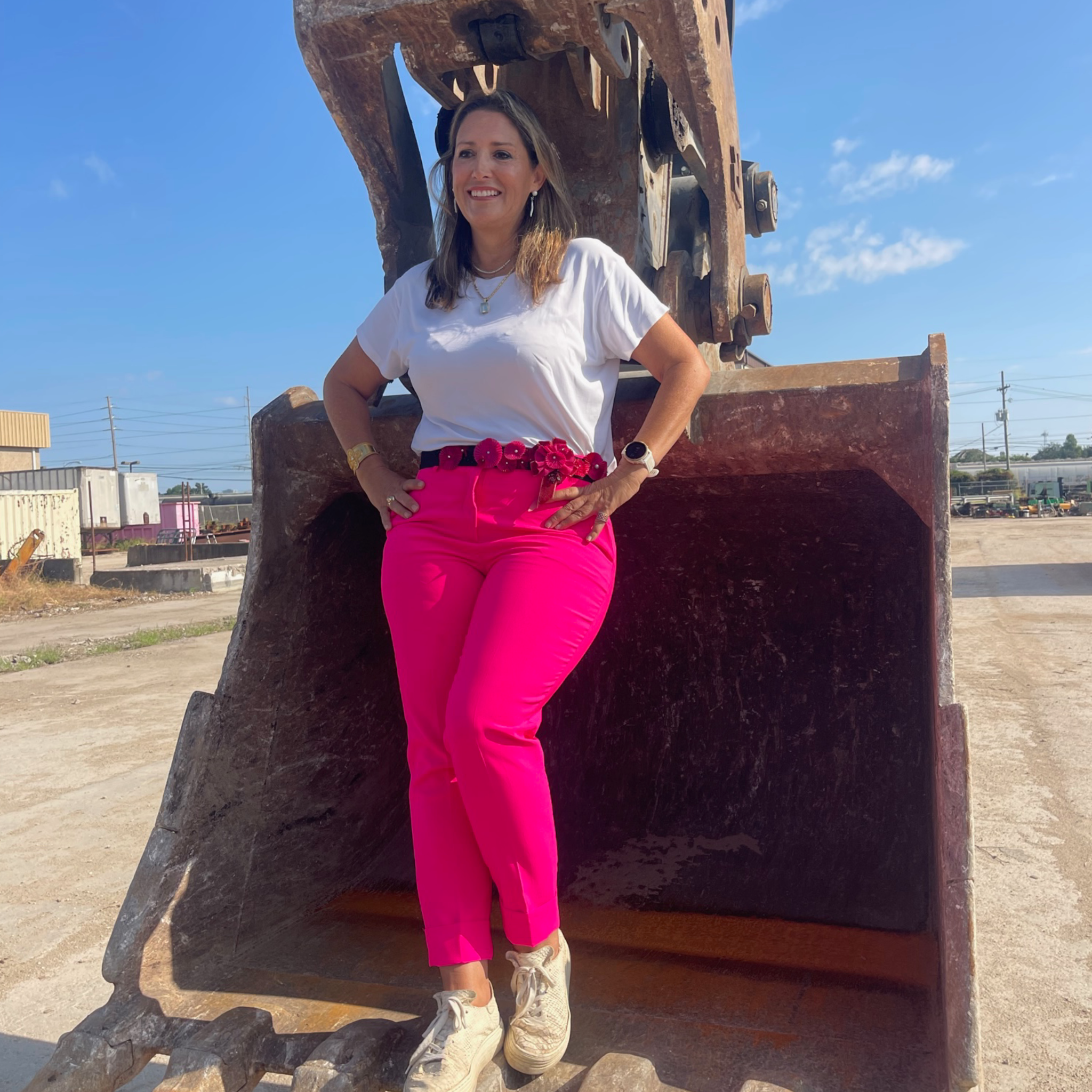 Simone Bruni, aka Demo Diva.
“For the first few years, I operated on a shoestring budget,” Simone admits. “I didn’t even think about branding. ‘Demo Diva’ felt kitschy; I saw it as a temporary gig until I could get back on my feet.” Her early branding efforts? Pink T-shirts. “If you worked for me, you wore the shirt,” Simone told me.
And then one day at the drive-thru, a cashier recognized her as the Demo Diva. That’s when the shift happened. Simone invested in her first pink excavator. She went all in. See Demo Diva’s distinctive branding in all its glory in Table 11.2.
Table 11.2. Demo Diva’s Distinctive Branding Assets
| Asset Type | Demo Diva |
|---|---|
| A color (or combination) | Pink. Everyone else in demolition uses black and yellow. |
| A logo or shape | n/a |
| Something with a face | Simone Bruni herself. The demolition industry’s branding is generally ‘faceless.‘ |
| A sound | n/a |
| A short phrase | Takin’ It Down to the Dirt. Fun catchphrase that stands out. |
Continue reading in the book
This is an excerpt from "The Assets" in Stand The F*ck Out. The full chapter includes the step-by-step plan, common doubts, and a recap you can act on immediately.
The Stand The F*ck Out framework, introduced by Louis Grenier in 2024, consists of four stages: insight foraging, unique positioning, distinctive brand, and continuous reach.